Some exposure to MRI Transforms in AFNI

Transform matrices are confusing!  There, I said it.  If you’ve never taken the time to play around with transform matrices in MRI, I completely understand.  That said, it’s not a bad idea to get some exposure to the world of warping and the matrices that they often depend on.  First of all, there are different types of transforms.  We tend to measure them in terms of how many parameters are allowed to vary (called Degrees of Freedom).

Linear Transforms

In AFNI, one of the most common transforms is a linear affine transform, which has 12 degrees of freedom.  There are a few AFNI programs for performing affine transforms, depending on what transform you are interested in computing.  If you wish to align the EPI (functional) runs to the anatomical dataset, you can use 3dAllineate or align_epi_anat.py (which calls 3dAllineate after some processing steps).  I recommend align_epi_anat.py since it gives me better registrations with default options than just calling 3dAllineate.

align_epi_anat.py \
-anat anat+orig. \
-epi epi+orig. \
-epi_base 0 \
-epi2anat \
-giant_move

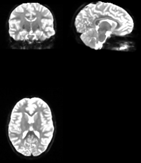
If you wanted to do an affine transform to standard space (TLRC or MNI), you can use @auto_tlrc, 3dAllineate, or align_epi_anat.py.  I recommend @auto_tlrc, as it gives me the best ANAT–>TLRC/MNI transformations.

@auto_tlrc -base TT_N27+tlrc. -input anat+orig

If we knew that our data often had very different CENTER points, measured by @Center_Distance, we could modify the above command to automatically align the centers of the dataset before beginning the transform via the init_xform option!

@auto_tlrc -base TT_N27+tlrc. -input anat+orig -init_xform CENTER

Using align_epi_anat.py and @auto_tlrc are also the defaults if you use afni_proc.py with the align and tlrc blocks.  And if you aren’t currently using afni_proc.py, I would highly recommend looking into it!

Nonlinear Transforms

In addition to linear transforms, AFNI “recently” (read: in 2013) added a new program for performing nonlinear warps (3dQwarp).  There is also a python wrapper script (auto_align.py), which will pair an affine transform and the nonlinear transform, similar to SPM’s DARTEL transform (J. Ashburner. A Fast Diffeomorphic Image Registration Algorithm. NeuroImage, 38(1):95-113, 2007.).  I highly recommend using auto_align.py for your nonlinear transform needs.

One important note is that you can call 3dQwarp with an -allineate option which will use 3dAllineate to do a linear affine transform prior to doing the nonlinear warping step.  Here’s where things start to get a bit tricky!  If you use 3dQwarp with the -allineate option, then the output transformations are automatically concatenated for you!  That means you get to skip the arguably “yucky” stuff that I’m going to talk about below.  However, if you use auto_warp.py, you will benefit from a lot of automatic options being applied (that likely will help your registration), at the cost of then having to concatenate your transforms!  But it’s really not that bad!

Concatenating and Applying Transforms

Why concatenate your transforms together when you could just apply them separately?  Well it’s usually a good idea to perform as few warping operations on your data as possible, so that you only resample (interpolate) your data a single time.  To combine these affine and nonlinear warps is fairly straightforward by following a of steps:

1.  Setup initial warp of original subject data to TT_N27 template:

auto_warp.py -base TT_N27+tlrc -input anat+orig -skull_strip_input yes

Even though auto_warp.py has given us the necessary files, as an exercise here you can try applying the matrices/warps to recreate the process!  Here we apply the combined affine and nonlinear warps on the original (skull-stripped) anatomical in order to warp to TT_N27:

3dNwarpApply -master TT_N27+tlrc \
-source subject_anatomical+orig \
-nwarp 'awpy/anat.un.aff.qw_WARP.nii anat.un.aff.Xat.1D' \
-prefix subject_anatomical_MNI

If you wanted to warp your EPI data to include the motion parameters, EPI–>ANAT transformation, and ANAT–>MNI you could concatenate all of them together to give you a single interpolation.  More on that later (though you can read ahead and look at how afni_proc.py does it!).

Is interpolation really that bad?

Some people think so.  But it happens one way or another!  You’re interpolating during slice time correction, motion correction, any type of transform, and possibly during other mathematical operations (like smoothing) depending.  The best you can do is try to reduce the number of interpolations, which afni_proc.py does for you.

Where do we go from here?

I recommend reading the cat_matvec help as well as the help for 3dAllineate and 3dQwarp.  Though likely you’ll be applying the transforms using 3dNwarpApply, which has a new option -iwarp, which will invert the transform of the warps supplied to it!

Intersection Maps in AFNI

I’ve recently been working with a dataset that included the same subjects across two studies (here: study1 and study2) that should give us complimentary information.  One of the ways that you can look at data across these two studies is to create “intersection” maps, that show where the brain regions were activated in both studies.  Obviously this also works for two conditions within the same study as well.

Since I’m using afni_proc.py for my data processing, it conveniently places the results folders in whatever location I tell it to.  In this case I like to put the results for each study within the overall folder for each subject.  So I might have two folders inside each subject, each with all of the preprocessed files and most importantly the stats files:

Subject01
-- Subject01.study1
---- stats.Subject01_REML+tlrc.HEAD
-- Subject01.study2

In this case I’ve taken care of all of the normalization/transformations to standard space, hence the +tlrc ending.  Now, you should do is use 3dinfo to find the T-Stat sub-bricks for the conditions that you are interested in.  You can then reference those sub-bricks using either the name or the number associated with the name.  I usually recommend using the name so that if you change your conditions around, you don’t have to renumber all of your scripts!

I’m not statistically testing the intersects here, just using them to see which brain regions overlap.  Because of this (arguably lax but useful assumption), I’m not doing anything fancy and simply opting for an FDR correction of the activation at q=.05.  The fdrval program in AFNI can be used to find the necessary t-statistic value for a given number of degrees of freedom to get a FDR q-value of 0.05 by supplying it with the sub-brick of interest and the p-value desired (other options exist too!).  If you wanted to do something a bit more intense you can use the cdf program within AFNI to calculate the t-value for a associated p-value and degrees of freedom and go wild!

Finally I input the necessary sub-bricks and thresholds into 3dcalc and voila, I get a map that shows me the overlap.

#!/bin/bash
study1BRIK='loadSynInt#0_Tstat' #recommend using the name
study2BRIK=17 #if you don't want to use the name, you can use the number

for aSub in Subject01 Subject02 Subject03 #simple loop over subjects
do
echo $aSub
#compute necessary t-value for a given q-value
study1_tval=`fdrval -qinput $aSub/$aSub.study1/stats.$aSub_REML+tlrc. $study1BRIK 0.05`
study2_tval=`fdrval -qinput $aSub/$aSub.study2/stats.$aSub_REML+tlrc. $study2BRIK 0.05`
#compute actual intersect map for that subject
3dcalc -prefix $aSub/${aSub}_intersect
-a "$aSub/$aSub.study1/stats.$aSub_REML+tlrc.[$study1BRIK]" \
-b "$aSub/$aSub.study2/stats.$aSub_REML+tlrc.[$study2BRIK]" \
-expr "and(step(a-$study1_tval), step(b-$study2_tval))"
done

Of course what you do with said information is up to you.

Tidbits on AFNI’s TENT function

I think we’ve all had that moment where we wonder what exactly our HRF function is doing to give us the results that we see in our data.  Using a fixed function regressor can be great for a number of reasons: 1) they don’t require many degrees of freedom, 2) someone else did the hard work to figure them out, 3) they often do a pretty good job of modeling the hemodynamic response that has been well documented.  Yet every so often we want to know what the actual response looks like, either to double check our Gamma function style HRFs or possibly because we’re interested in aspects of the shape of the actual response.  Consider this a quick introduction to some options you have when using TENT functions for estimating the shape of the blood flow response directly from the data.

TENT

First and foremost, it’s not always necessary to go back and rerun all of your data (including preprocessing) using a new afni_proc.py script.  Instead you can use a modified script to just take your already preprocessed data and run only the regression step (see how here).  Great, well that just saved you a ton of time, so head over to the 3dDeconvolve 2004 upgrades page and take a peek at some of the “newer” possibilities.

Basic TENTs

Now that you’ve read that, let’s take a quick second to look at some of the essential parts of our afni_proc.py (or 3dDeconvolve) options.  First and foremost you have your actual definition of the TENT function, which usually goes something like:

-regress_basis 'TENT(0,12,7)'

Here I’m asking 3dDeconvolve to estimate the response starting at the stimulus onset (0 seconds) and estimate out to 12 seconds.  Since I have a TR of 2 seconds, that means that there are 7 possible TENTs to fit during this time.  When you do this, 3dDeconvolve will generate a Coef and Tstat for EACH and EVERY TENT that you requested.  This isn’t always terribly useful since you may not really care what the “area under the curve” is for say TENT #5 independent of everything else.  Fortunately, you can use the GLT system to get the average over all of these TENTs:

-gltsym 'SYM: +1*conditionA' -glt_label 1 'ConditionA'

Displaying TENTs in AFNI

Once you’ve run an analysis with TENT, you can visualize the TENT at any voxel within the AFNI viewer using the following steps.

  1. Open AFNI viewer, set underlay as your anatomical
  2. Optionally you can set the overlay to the stats dataset and select your GLT as described above.  This will show you were there is activation according to the model, which may help inform your selection of a voxel to visualize.
  3. Open a new AFNI viewer (press the New Button) and make the following selections
    1. Set underlay as the iresp file representing your condition of interest
    2. Click the graph button
  4. At this point, moving around on the statistical dataset will show you what the associated response looks like for that particular location.

Other TENT Possibilities

If you want to force your first and last time points in the TENT to be zero, you can use the TENTzero function instead of TENT.  This might be useful.  Ok, it is useful.

Alternatively, if you like the idea of ERPs using peak measures, you might want to contrast the “peak” of your response to the “baseline” or pre-stimulus intervals.  In order to do this, you should tell 3dDeconvolve to use TENT to model some of the time series BEFORE the onset of a stimulus as so:

TENT(-4,12,9)

Here we ask 3dDeconvolve for 4 seconds before the onset of the stimulus and extending to 12 seconds after the stimulus, using 9 TENTs.  In this case, you may not want to use the same GLT you did before, because it would include the pre-stimulus time in the average.  So you can use square-brackets to index one or several TENTs:

-gltsym 'SYM: -1*conditionA[0..2] +1*conditionA[4..6]' -glt_label 1 'conditionA_Peak'

Here we’re subtracting the first 3 TENTS (0, 1, 2) from what I’m calling the “peak” TENTS (4, 5, 6).  Now it’s important to recognize that TENT 0 is -4 seconds, TENT 1 is -2 seconds, TENT 2 is at 0 seconds relative to stimulus onset.  Continuing on TENT 3 is at 2 seconds, TENT 4 is at 4 seconds, TENT 5 is at 6 seconds, and TENT 6 would be at 8 seconds.  So we’re subtracting activations 4 seconds before the stimulus onset from activations 4-8 seconds after.

But how much of a difference does it really make?  Well, of course this is fMRI, so the answer is “it depends”.  If we look at the response curve shown at the top of the article, you might recognize how close it looks to the Gamma function.  If we compare the resulting maps on a basic in-scanner reading experiment, you can see the Gamma shows the most activation; TENTzero over a 12 second window and “TENT Peak” where I pull out the peak (4-8 seconds) and subtract the pre-stimulus interval are fairly close in activation.

I also included the map for the average over both the pre-stimulus and post-stimulus interval to illustrate that you want to be careful NOT to accidentally include the entire window if you have the pre-stimulus baseline included as it may reduce the activations of interest.

TENT_Demo

R for MRI Lovers (Part 2)

Writing this post after the first in the series may seem somewhat backwards!  Last time we covered reading in data from individual subjects and plotting them as box plots with error bars in R.  This time we’ll do something even more straightforward – plotting ROI group effects.  If you haven’t already read it, there are a variety of ways to make ROIs in AFNI (including how to make them from pre-existing coordinates).  You might also want to review how to combine several ROIs into a single mask (part 1, part 2) for use with AFNI.  Ready?

So you’ve run some type of group analysis, let’s make it simple and say that you ran 3dttest++ (review here), and make it even more simple and say that you either 1) used the -brickwise option to perform all of the t-tests and have them in a single file (see how here), or 2) you concatenated your t-test results into a single file using 3dbucket.  At this point you have a single HEAD/BRIK pair (or NIFTI) file that contains multiple sub-bricks.  The great news is that you can extract the necessary data from these to plot your group effects!

The first thing you should do is look at the structure of your group analysis file, which should look something like what is shown below.

 -- At sub-brick #0 'con_1_Mean' datum type is float: -3.33262 to 5.03709
 -- At sub-brick #1 'con_1_Tstat' datum type is float: -5.8228 to 14.9712
 statcode = fitt; statpar = 13
 -- At sub-brick #2 'con_2_Mean' datum type is float: -3.35317 to 5.65061
 -- At sub-brick #3 'con_2_Tstat' datum type is float: -6.88651 to 16.3167
 statcode = fitt; statpar = 13
 -- At sub-brick #4 'con_3_Mean' datum type is float: -3.64771 to 5.21773
 -- At sub-brick #5 'con_3_Tstat' datum type is float: -7.4722 to 15.4066
 statcode = fitt; statpar = 13

Here you can see I have three conditions, each has a Mean and a t-statistic.  For plotting purposes, I’m just going to need the mean values and for now I’ll ignore the t-values.  If I simply want to get all of the values out of the group file within an ROI (say Left STG), I can use 3dROIstats:

3dROIstats -mask L_STG_small+tlrc. t.test_val+tlrc.'[0..5]'
File Sub-brick Mean_1 
t.test_val+tlrc.[0..5] 0[con_1_] 0.400111
t.test_val+tlrc.[0..5] 1[con_1_] 1.979007
t.test_val+tlrc.[0..5] 2[con_2_] 0.289859
t.test_val+tlrc.[0..5] 3[con_2_] 1.398176
t.test_val+tlrc.[0..5] 4[con_3_] 0.239496
t.test_val+tlrc.[0..5] 5[con_3_] 1.129553

And this by itself is generally helpful because I could read this into R and then figure out which values are means and which are t-stats.  But that’s additional work that you don’t necessarily HAVE to do, because AFNI makes it easy to just select EVERY OTHER sub-brick (using the parentheses in the sub-brick selector).

3dROIstats -mask L_STG_small+tlrc. t.test_val+tlrc.'[0..5(2)]'
File Sub-brick Mean_1 
t.test_val+tlrc.[0..5(2)] 0[con_psw1_] 0.400111
t.test_val+tlrc.[0..5(2)] 1[exc_psw1_] 0.289859
t.test_val+tlrc.[0..5(2)] 2[uncon_psw] 0.239496

Now if you save that information to a file (using pipes in linux/unix/mac), you can make that the input for other programs (1dplot or R).

3dROIstats -mask L_STG_small+tlrc. t.test_val+tlrc.'[0..5(2)]' > values.txt
1dcat values.txt[2]{1..$} | 1dplot -stdin

RforLovers2_1dplot

or read them into R:

thedata = read.table(file.choose(), sep='\t', header=T)
plot(thedata$Mean_1, type='b', xlab='Condition', ylab='Activation', main='Fancy Line Graph Title)
rforlovers2_lineplot
Or you can make a fancy bar-plot:
barplot(thedata$Mean_1, xlab='Condition',ylab='Activation', main='Fancy Title Here')

rforlover2_bargraph


This concludes the quick plotting of today in R.  I’m working on a few interesting projects right now and hope to post something about them very very soon!

TORTOISE Processing of DWI/DTI (Part 3)

In Part 1, we covered how to preprocess your Diffusion Weighted Images (DWI) for “correction” of movement, eddy currents, and other artifacts in your data.  In Part 2, we covered fitting the tensors and exporting the resulting data to AFNI or other packages.  Today we continue by talking about an additional feature of TORTOISE, which is combining data from sequences with different acquisition parameters – specifically the “b-up and b-down” sequences where one DWI run is collected in one encoding direction (Anterior to Posterior) and a second run is collected in the opposite encoding (Posterior to Anterior).  You’ll notice in the DWI images below, that the distortions are different for the A-P image (left) and the P-A image (right).  Specifically, the A-P image shows some indentation into the frontal lobe seen in both axial and sagittal views, in the P-A encoding you may notice that this distortion isn’t as clear and there’s some distortion to the visual cortex.

blog

Note that images could also be Left-Right and Right-Left encodings, the impotence here is that you have two “balanced” collections of DWI data in two encoding directions.  If this is sounding a bit familiar, it’s because other software tools (like FSL) have implemented similar functionality in recent releases.  Head over to Andy’s Brain Blog for a nice writeup of using topup and eddy.

The tool to do this in TORTOISE is bup_bdown_vm and is available in the DIFF_PREP section of the analysis package.  In order to use this tool, you’ll first need to preprocess all of your data in TORTOISE’s DIFF_PREP tool.  One important change is to make sure that you turn on the option for “Keep intermediate data”, as TORTOISE will need these files to perform a single transformation incorporating the motion, eddy current, and encoding direction corrections all at once!

updwn_box


Once you have run DIFF_PREP on both of the encoding directions, you will run the new tool – bup_bdown_vm.  Start the tool just as you have the DIFF_PREP/DIFF_CALC in the past (you can double click it on a Mac).

bupdn_gui

Here you will select your up and down data list files.  These are the DWI_AP_up.list and DWI_PA_up.list files (your file names may vary).  We are selecting the _up.list files.  For the structural image, you should select your T2 image (or T1 if you don’t have a T2), and then I usually leave the other options at their defaults.

When you click “Process” go for a very long walk, as this process can take several hours (6 hours on one of my datasets).  Fortunately you can continue to do other things on your computer during this time.  For those who might be thinking “wow, that’s a really long time!” I can say that FSL’s tools can also take quite a while to do a similar process.  Granted they may be slightly faster but they’re also working differently.  Once the process finishes, you’ll need to still run the DIFF_CALC steps to fit the actual tensors.

You can see that the process has done a nice job of correcting the distortions in both the anterior and posterior portions of the head when looking at the b0 image.

tortoise_updwn_corrected


On my list is to compare the performance of FSL’s tools to TORTOISE.  Though I suspect the good folks over at NIH have already done some of these comparisons!